2025
GIS4Health

GIS4Health is a rebuilt and expanded version of an earlier health mapping project for Biliran Province. Where the original was a PHP/MySQL system with basic heatmap overlays, this version is a full-stack Laravel + React application with smarter filtering, modern map rendering, and an embedded AI assistant. The core goal is the same — give health officers a spatial view of disease data — but the execution is significantly more capable.
Overview
A web-based geospatial health monitoring system built with the Laravel React starter kit (TypeScript, Inertia.js) and MapLibre GL JS with MapTiler tiles. It visualizes disease case data across Biliran Province through two map views: a weighted heatmap for spotting density clusters, and a 3D fill-extrusion choropleth for comparing case counts across barangays. An embedded AI assistant powered by OpenRouter provides contextual guidance about the system.
Features
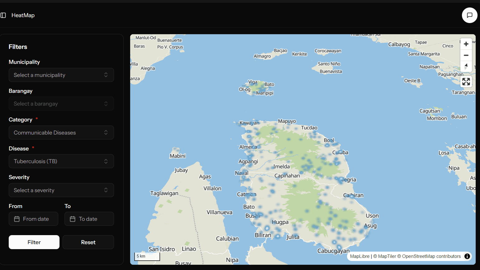
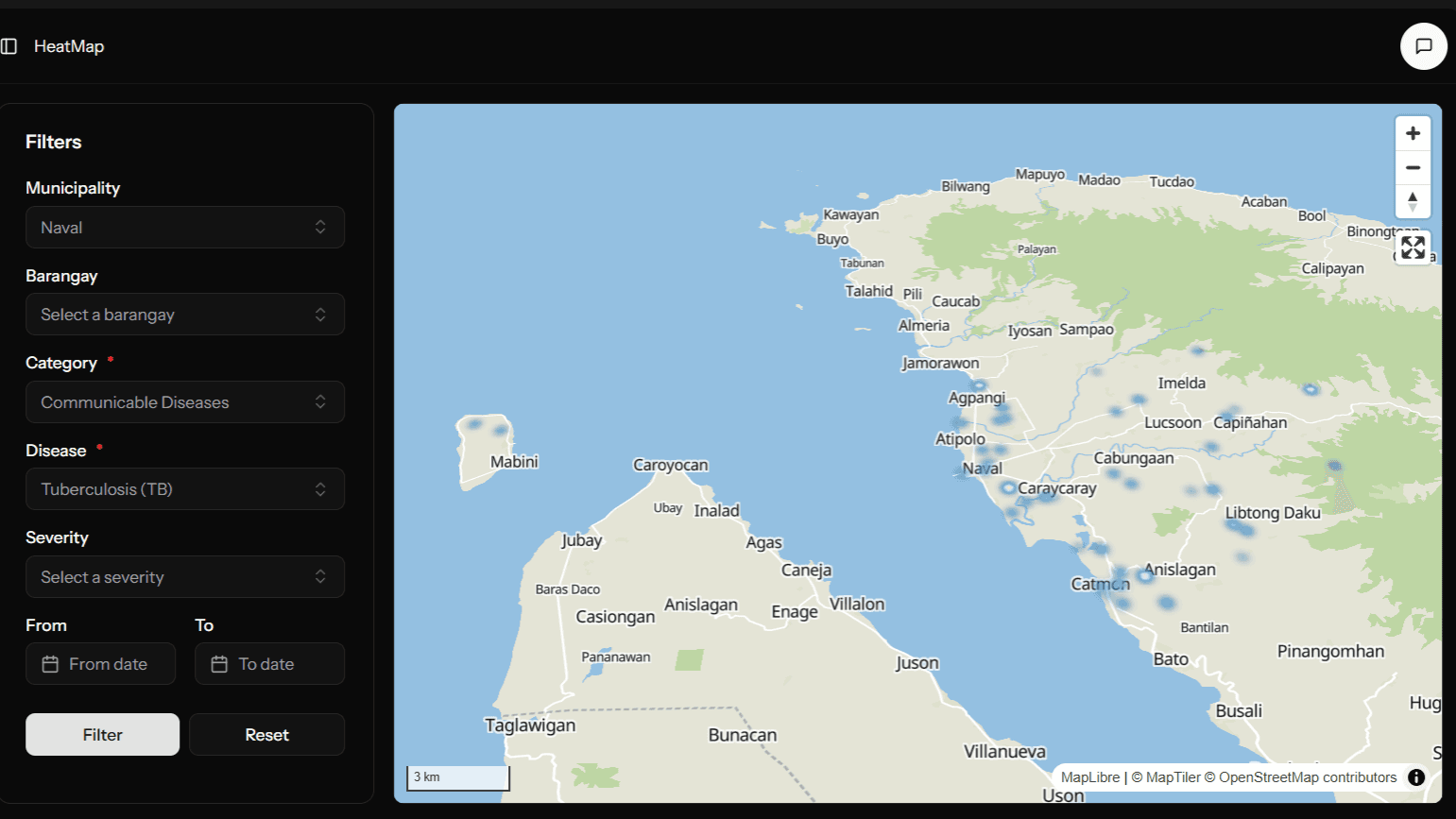
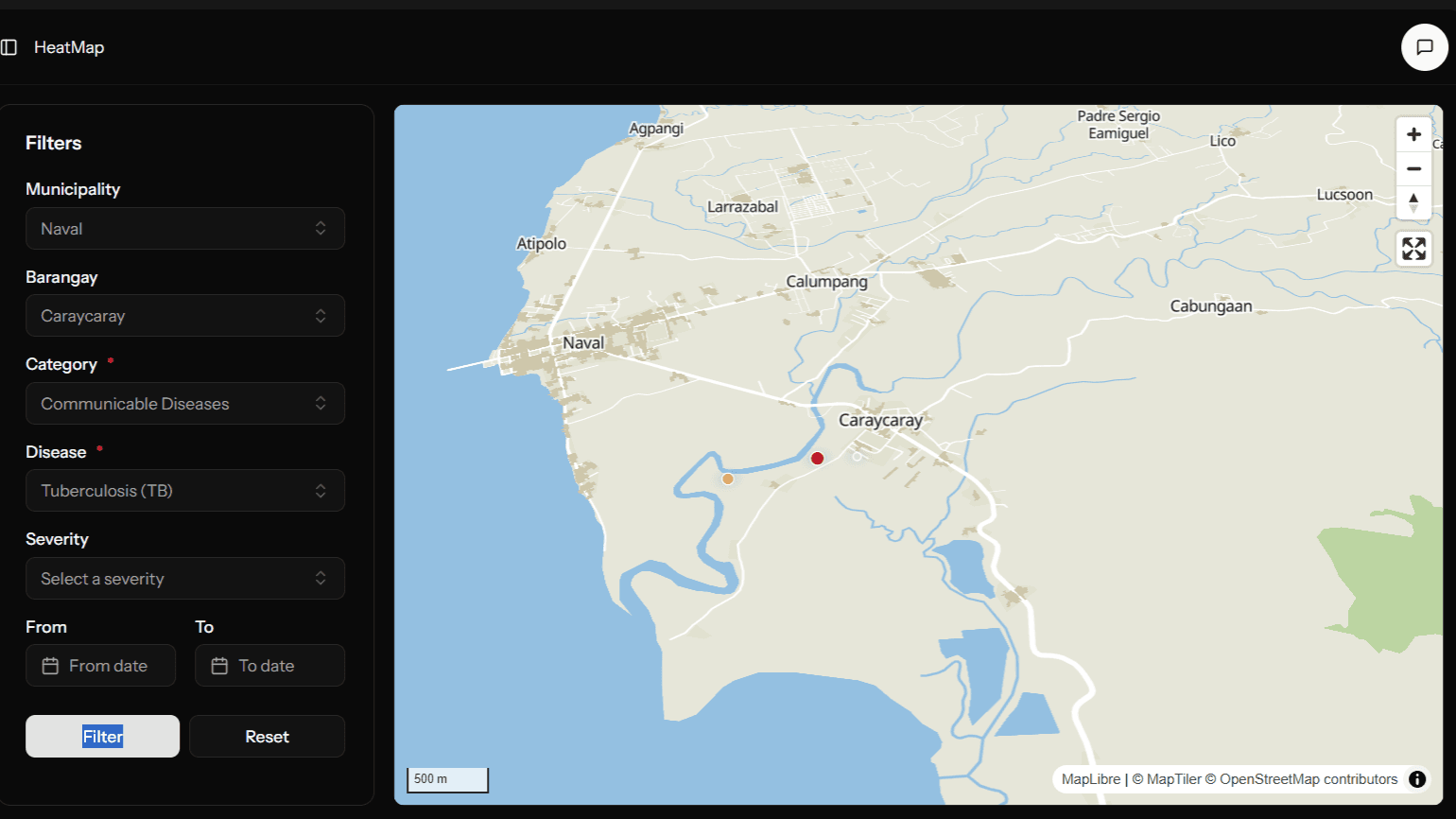
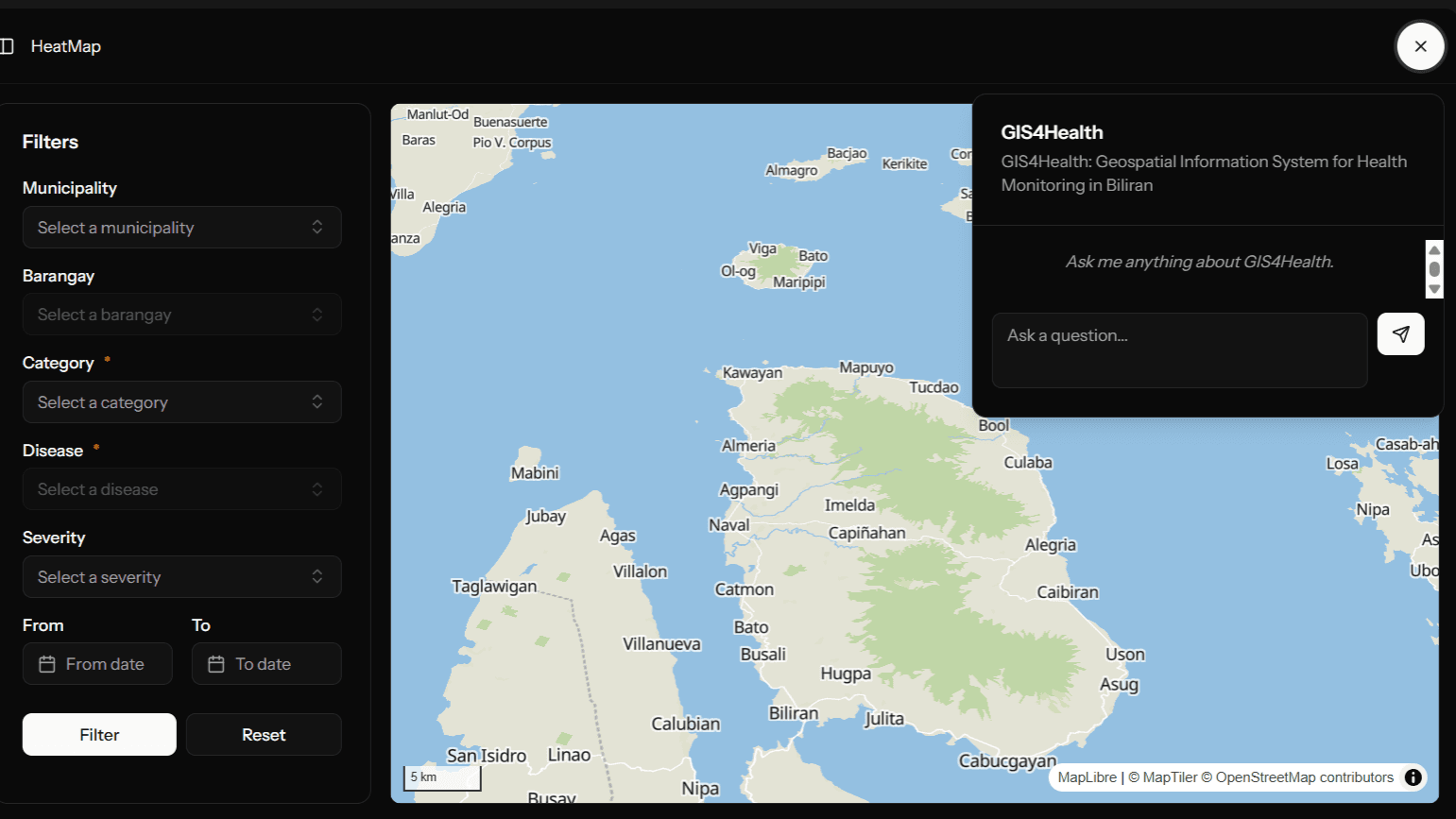
- Heat Map with Smart Filtering — Filter by municipality, barangay, disease category, severity, and date range. Selecting a municipality zooms the map to that area; adding a barangay narrows it further. The map responds to each filter combination dynamically — disease density updates in place without a page reload.
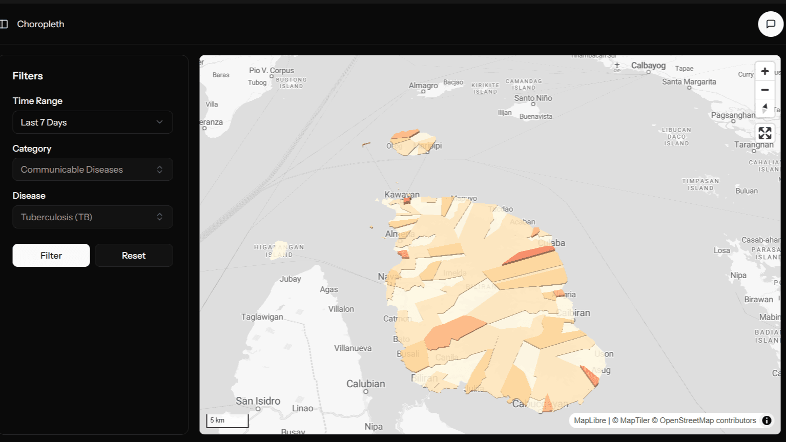
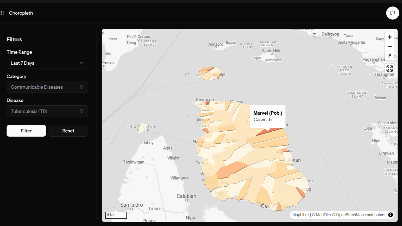
- 3D Choropleth Map — Barangay-level fill-extrusion map where height and color both encode case count. Time range selector (7 / 30 / 90 days) adjusts the color scale automatically. Hover tooltips show barangay name and case count inline.
- Contextual AI Assistant — An embedded chat panel powered by OpenRouter gives users a natural language interface to ask about the system's purpose, features, and how to interpret the maps. System prompt provides full context about GIS4Health and Biliran Province. API key is intentionally removed in the current build — the architecture is in place for deployment with a live connection.
- MapTiler + MapLibre GL JS — Modern vector tile rendering with 45° pitch and bearing by default, navigation controls, fullscreen, and scale bar. Both maps are bounded to Biliran Province to prevent accidental panning off-area.
Tech Stack
- Laravel — Backend routing, data API, and session management
- React + TypeScript — Frontend via Laravel React starter kit (Inertia.js)
- MapLibre GL JS — Map rendering for both heatmap and choropleth views
- MapTiler — Vector tile styles (basic-v2 for heatmap, streets-v2-light for choropleth)
- Turf.js — Bounding box computation for dynamic zoom-to-feature
- shadcn/ui — Component library for filters, dropdowns, and UI shell
- OpenRouter — AI assistant API (disabled in current build)
How the Maps Work
The heatmap uses a weight-based heatmap layer that transitions to individual circle markers at zoom level 12+, so density clusters are visible at province level and individual cases become readable when zoomed in. Intensity, radius, and opacity all interpolate with zoom level to stay readable across scales.
The choropleth uses fill-extrusion — barangays are rendered as 3D columns where height is value × 100 meters. Color interpolates from light yellow through orange to deep red based on the selected time range's scale maximum (10 / 50 / 100 cases). This makes both magnitude and geographic distribution readable simultaneously.
Both maps use flyTo and fitBounds (via Turf.js bounding box) for smooth animated transitions when filters are applied.
Limitations
AI assistant — no live DB connection. The current build uses a static system prompt as context for the AI rather than pulling live data from the database. The architecture supports a real connection — the intent was always to feed live case summaries into the prompt — but the goal for this build was to validate the UX pattern first. The API key is removed; re-enabling requires dropping in an OpenRouter key.
Data scope. Like its predecessor, the system is scoped to Biliran Province. Extending to other provinces would require new GeoJSON boundary data and a corresponding data pipeline.
Reflection
This project was about closing the gap between what the original system could do and what it should do. The PHP version proved the concept — heatmaps and choropleths can meaningfully change how health data is read. This version asks: what does that tool look like when it's actually well-built? Smarter filters, proper TypeScript, a modern map renderer, and an AI layer that can explain the system to users who aren't GIS-literate.
The AI assistant is the most experimental piece. Connecting it to live data would make it genuinely useful — a health officer could ask "which barangay had the most dengue cases this month" and get a direct answer instead of interpreting the map themselves. That's the natural next step.